Meadow · Child Interaction Design
One world, three stages of growing capability
As a child grows from first words to full sentences, the screen doesn't become a different app — the same room, the same objects simply reorganize to match what the child can now do.
The tiers are told apart by what the child can do — not by redecorating the room.
Responding to the "still too busy" note: Tier 2 is redesigned. The background image is gone — objects now sit on a calm field, reached through container objects (fridge, cabinet, stove, lunchbox) across the top. The room still does its job: it decides which words appear and, with Smart sizing, makes the most-useful ones bigger. Tier 1 (scene) and Tier 3 (grid) are shown as before for comparison; both are still open to iterate.
📏 Top = brought to you, bottom = go find it. Scene and time of day decide what grows into the big cells up top; the bottom row is always a swipe drawer so the child can reach any food, even ones Meadow didn't surface.


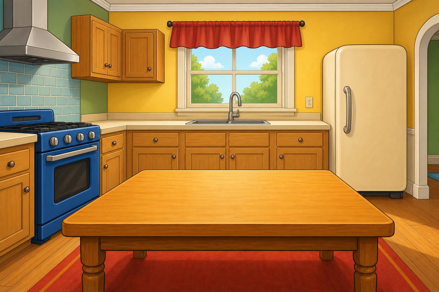




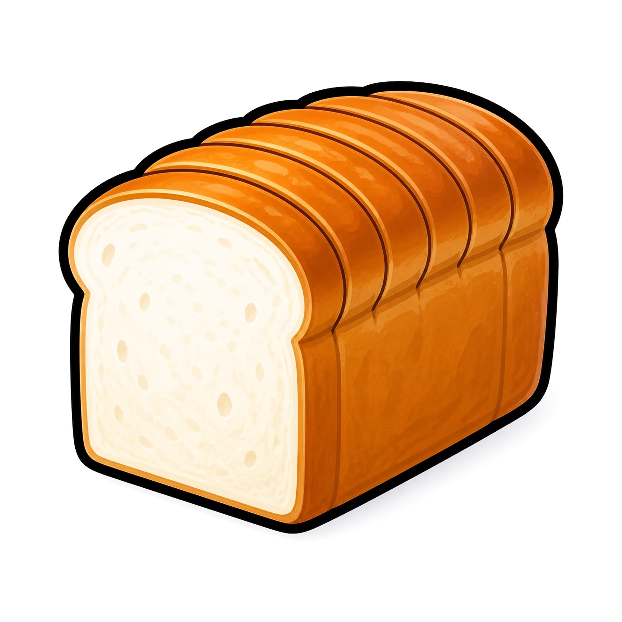

A few real objects sit in the room, placed naturally. The scene is present, softly faded. Tap one and Meadow says the word. No sentence-building expected yet.
The photo is gone. Objects live on a calm field, reached through container objects across the top. The room lays the most-likely foods into a deliberate bento grid (biggest = most likely now), while the bottom row stays a swipe drawer so nothing is ever locked away. Calmer than before — and a plain grid can't size by relevance or keep everything one swipe off.
Bold, high-contrast tiles on a full grid — maximum breadth for sentences and conversation. The top strip re-sorts the grid by location. Shown as before; still open to iterate.
What we'd value your read on for Tier 2
Two things: (1) Tile style — a soft glow halo (object floats, no edge), soft circles (gentle discs), or defined grid tiles (crisp 60pt targets, one language as the child grows)? (2) Smart sizing — does the relevance bento (big cell = most likely now, with a swipe drawer holding the rest) feel right, or would you rather every word stay even? Toggle both above to compare. The same bento language is how relevance and item-count would reconcile at Tier 3.
Tier 2 container objects (fridge · cabinet · stove · lunchbox) are sketched to show intent — final versions are drawn in our Bright & Bubbly style, matching the food art. Swipe-drawer tiles are smaller here for clarity; in the app every tappable tile holds a 60pt minimum.
Interactive concept — switch the three tiers above; Tier 2 has its own style / size / before-after controls, Tier 3 has a density control. The compass frame, core-word edges, avatar and Buddy are constant across all tiers; only the center stage changes.