Visual Design System
Your child's voice should feel like their world.
Meadow's engine — vocabulary, navigation, speech, accessibility — is style-agnostic. Every symbol, scene, avatar, and animation is resolved through a swappable design pack. What you're choosing here isn't functionality. It's personality. The same child taps "juice" in all four worlds below — but the feeling is completely different. For how the child navigates and interacts with these visuals, see Interaction Design.
Choose the direction that best supports Meadow’s emotional tone, brand differentiation, and market-facing personality. This is a direction choice, not a final lock on every production asset.
Assess whether each style preserves symbol clarity, tolerates Fitzgerald Key colors, and avoids unnecessary visual complexity for the AAC population.
Eight words, four worlds
The same vocabulary rendered in each style. Every tile also shows its Fitzgerald Key grammar color — the clinical color coding that SLPs use to teach word categories. See how each style integrates those fixed colors without looking clinical.
| Word | Soft Crayon | Storybook | Bright & Bubbly | Gouache |
|---|---|---|---|---|
| juice noun | 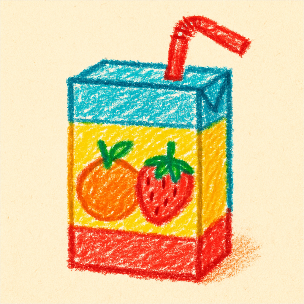 |
 |
 |
 |
| more descriptor | 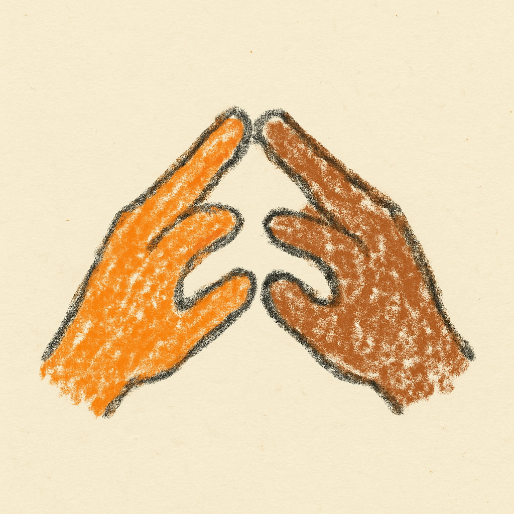 |
 |
 |
 |
| go verb | 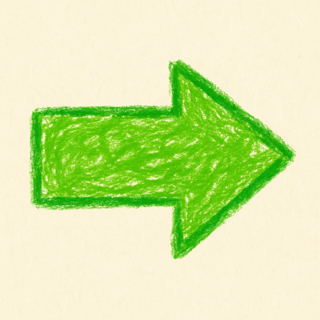 |
 |
 |
 |
| happy feeling | 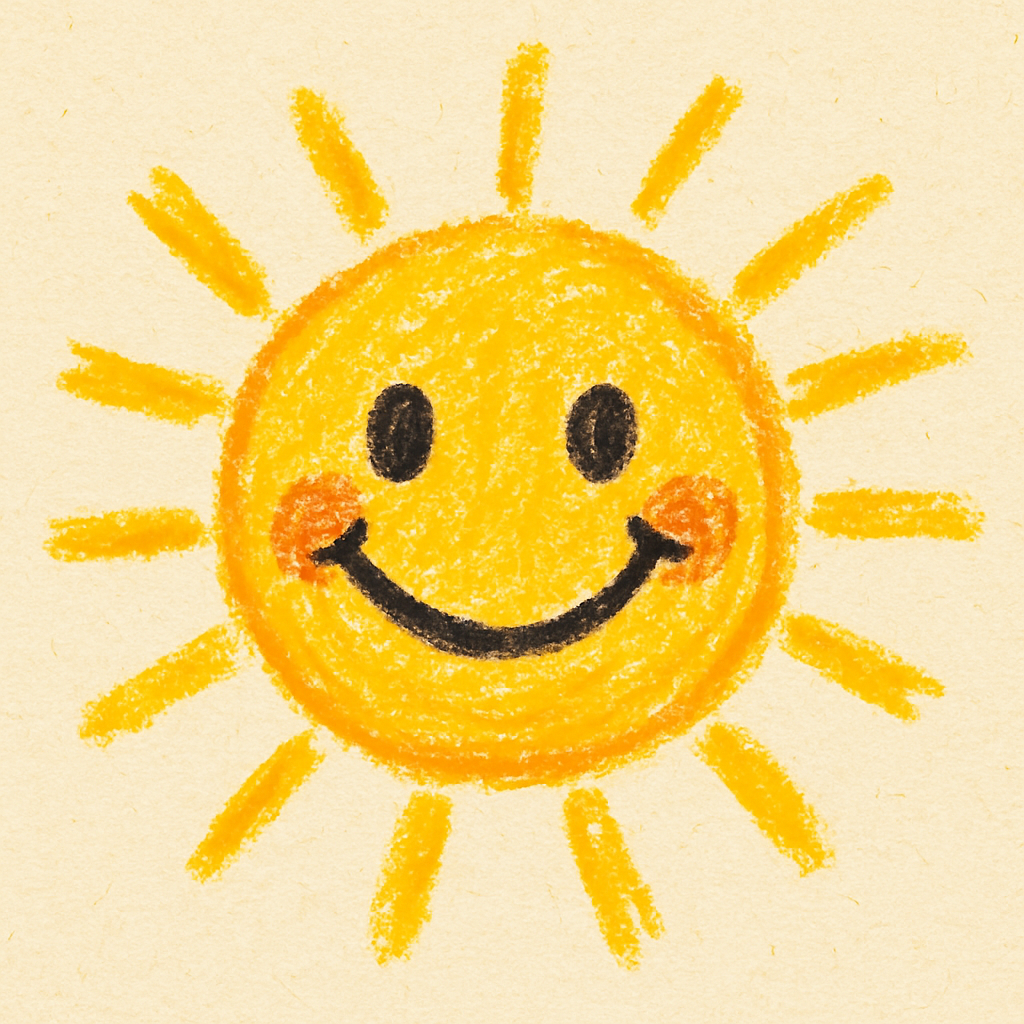 |
 |
 |
 |
| mommy person | 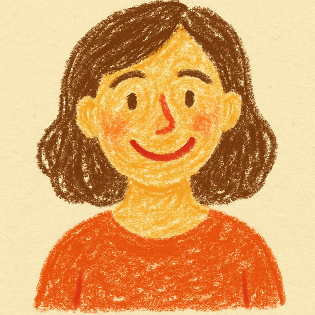 |
 |
 |
 |
| help verb | 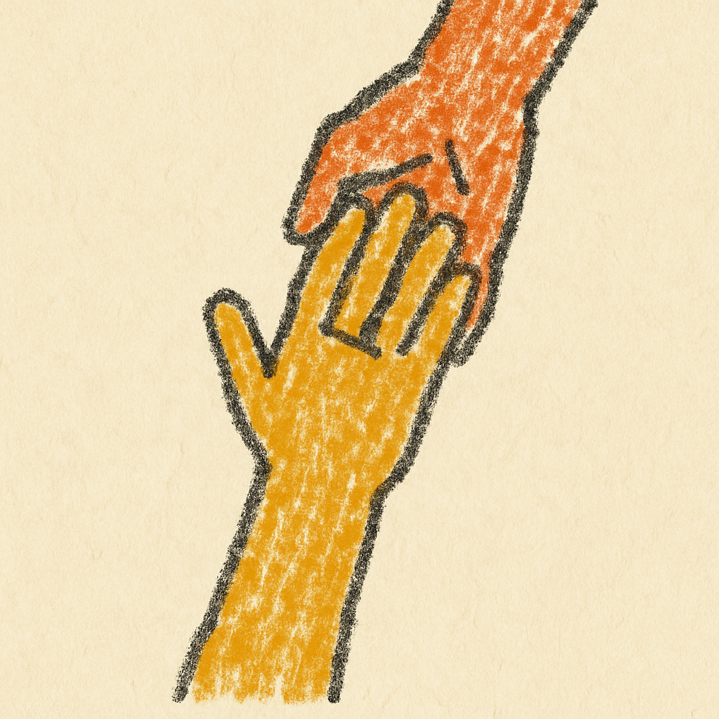 |
 |
 |
 |
| dog noun | 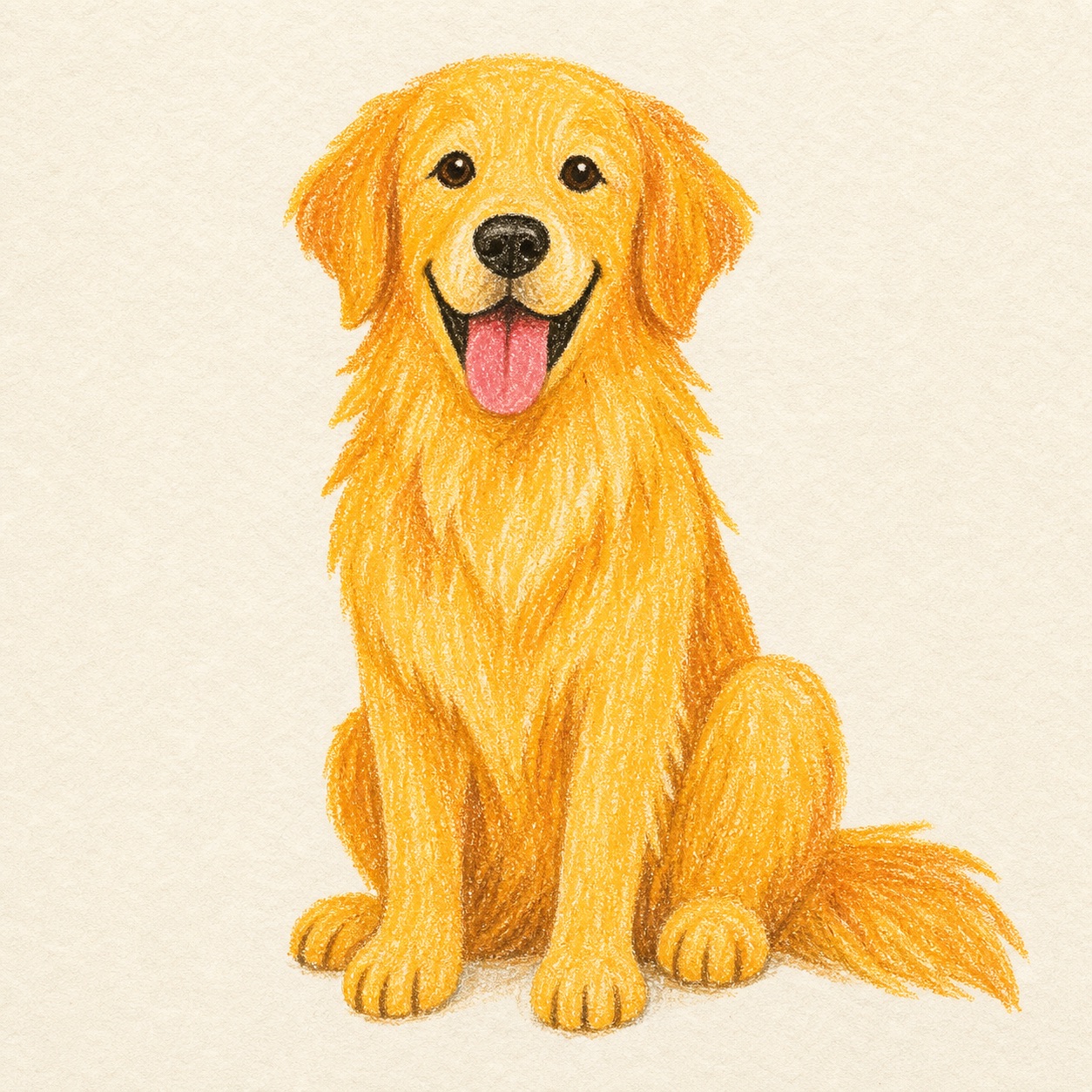 |
 |
 |
 |
| all done phrase |  |
 |
 |
 |
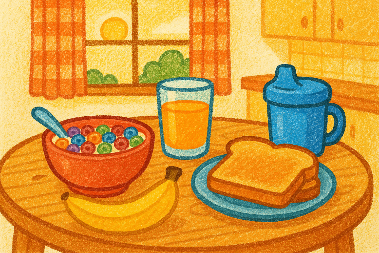
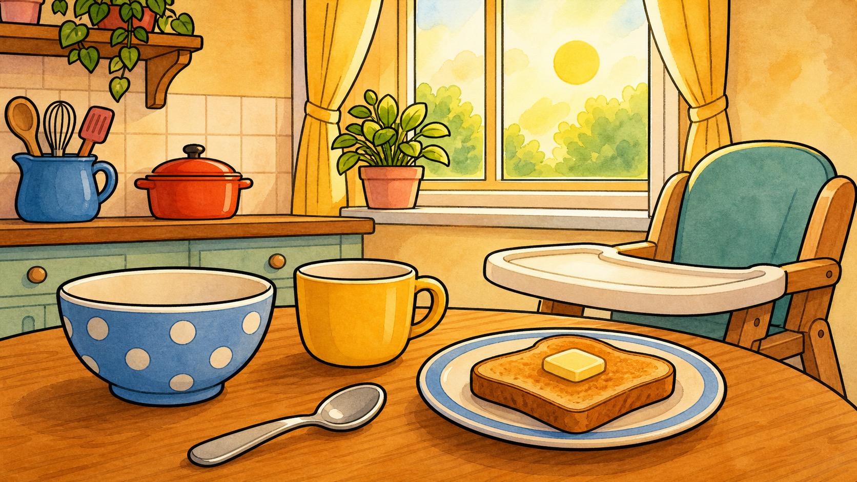
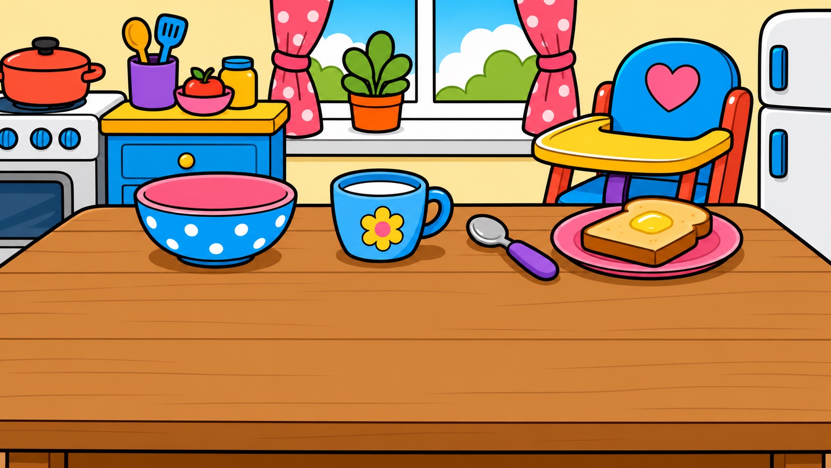
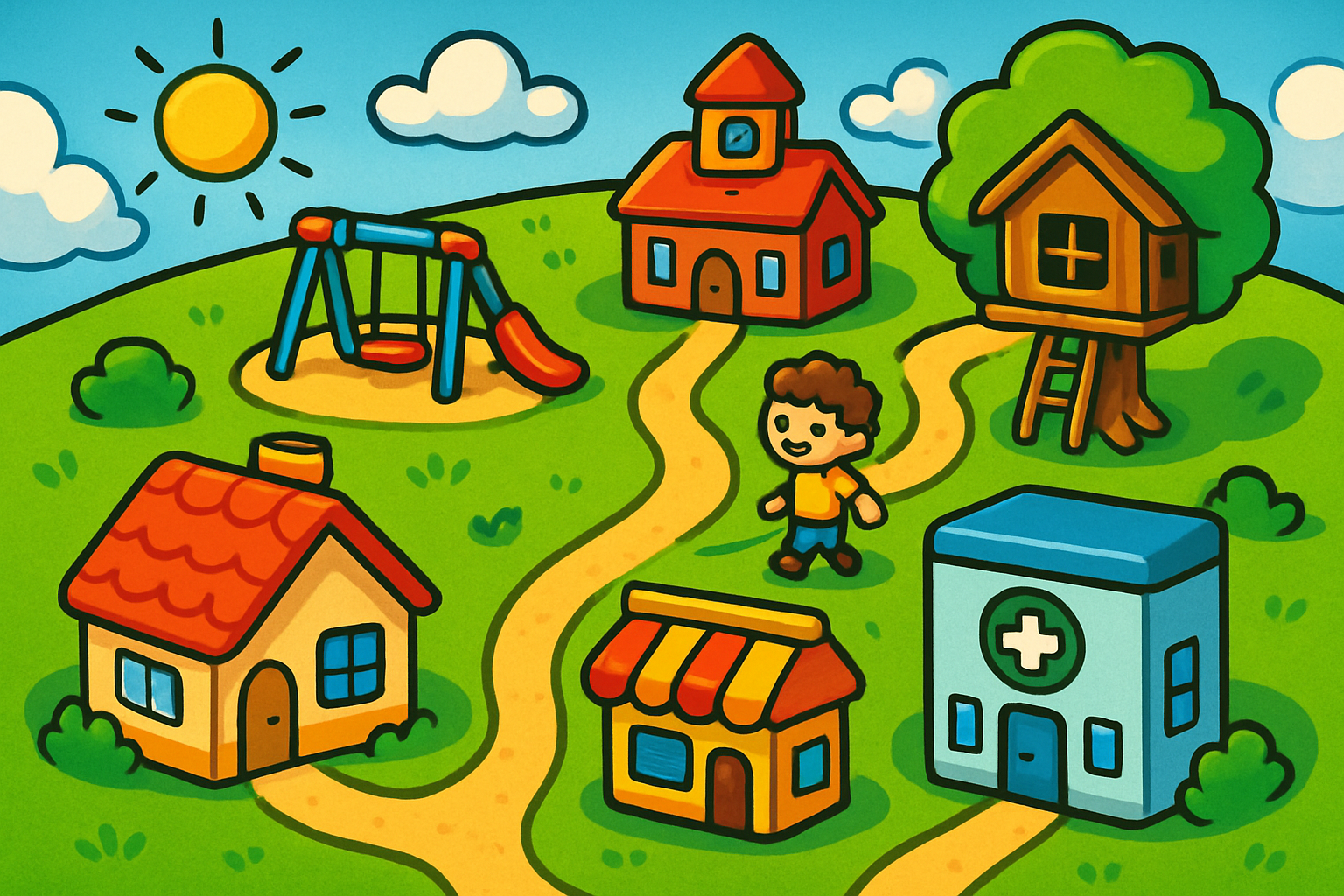
Breakfast routine — one scene, four styles
The same routine scene (Time to Eat) showing how symbols, backgrounds, and color interact in context. This is what the child actually sees — symbols overlaid on the scene they're communicating about.
Soft Crayon
Thick wax crayons on textured paper. Visible crayon strokes and waxy texture, slightly messy coloring that doesn’t stay in the lines. Every symbol looks like the child drew it themselves — and that’s exactly the point. Ownership before perfection.
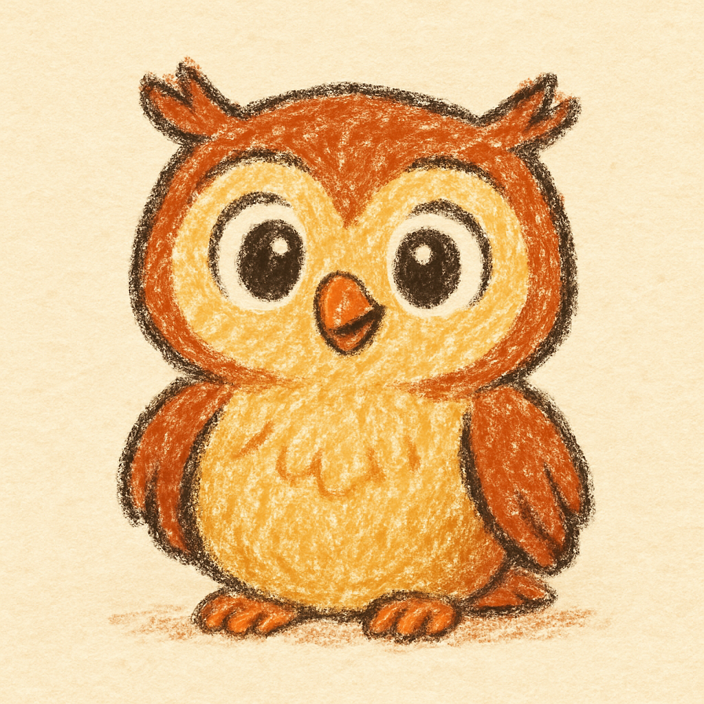
Fitzgerald Key treatment: Crayon-thick bottom stripe in the grammar color. The waxy texture makes color coding feel drawn by hand, not printed by machine.
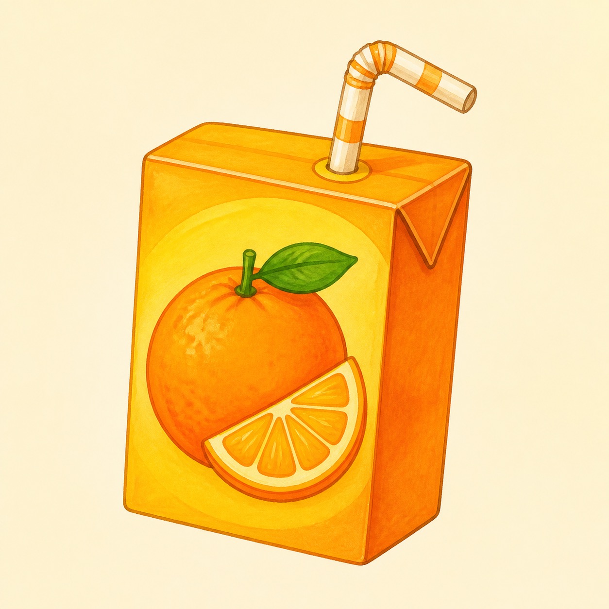
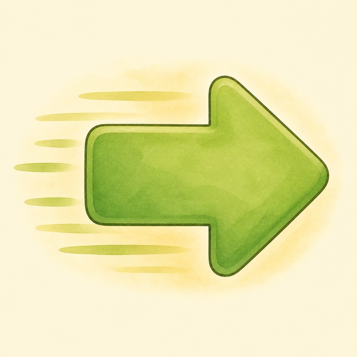
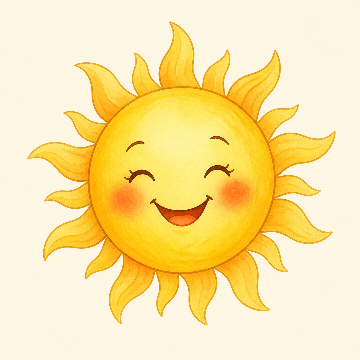
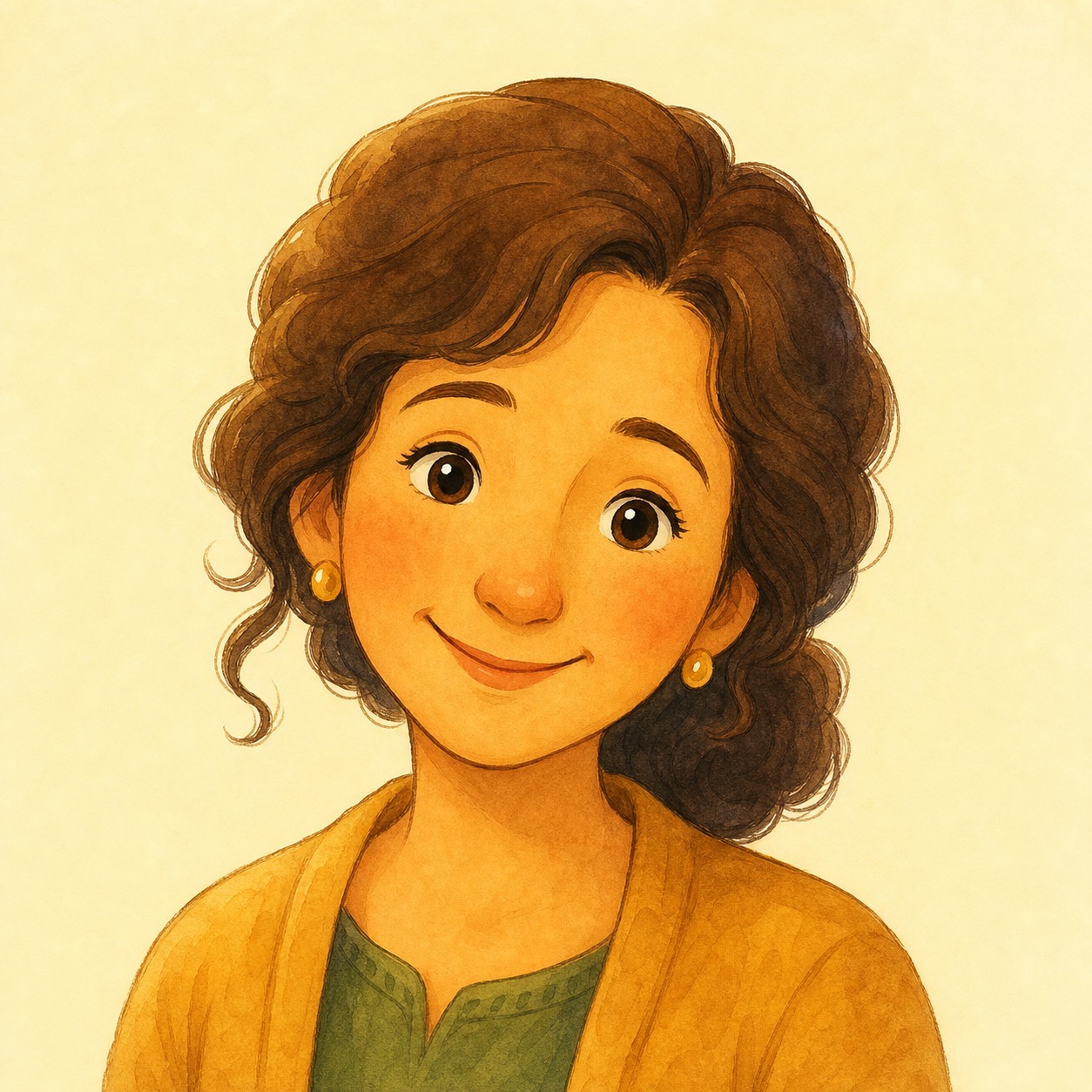
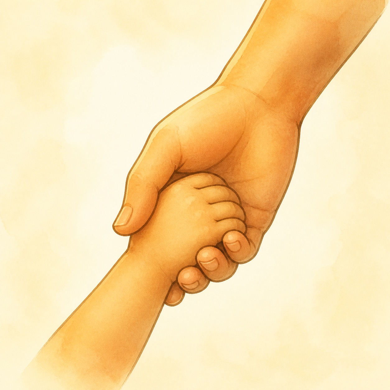
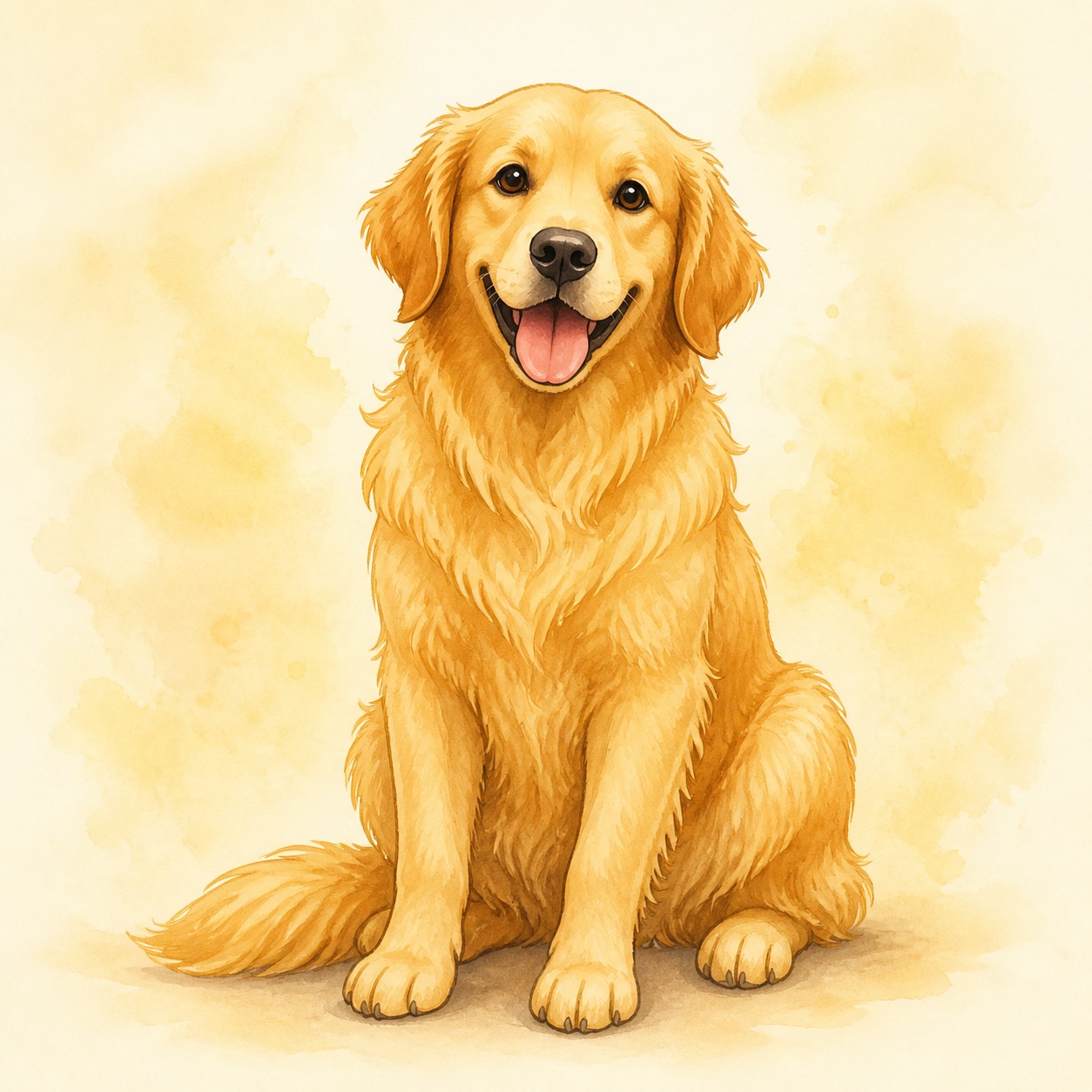
Storybook
Soft watercolor wash with gentle ink outlines. Every symbol looks like a page torn from a beloved children’s picture book — warm golden light, rounded shapes, the cozy feeling of a bedtime story. Polished but never cold. The world feels safe, magical, and worth exploring.
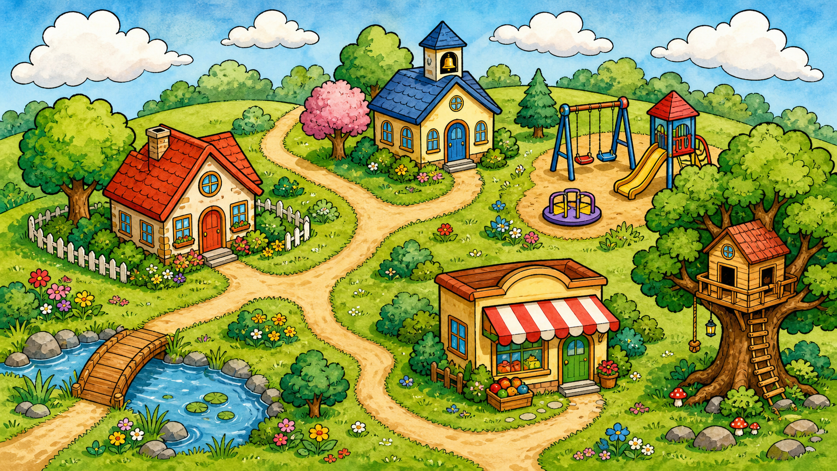
Fitzgerald Key treatment: Soft watercolor stripe at the bottom of each tile. The warm cream background lets grammar colors read clearly without feeling clinical — the colors feel painted, not printed.
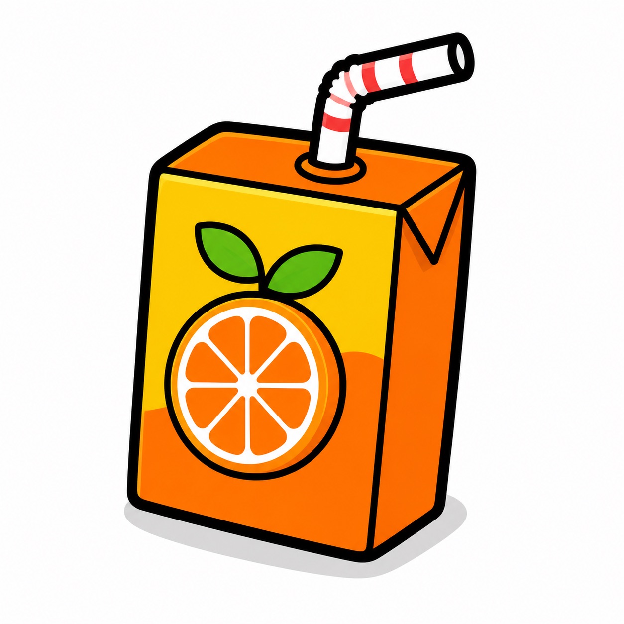
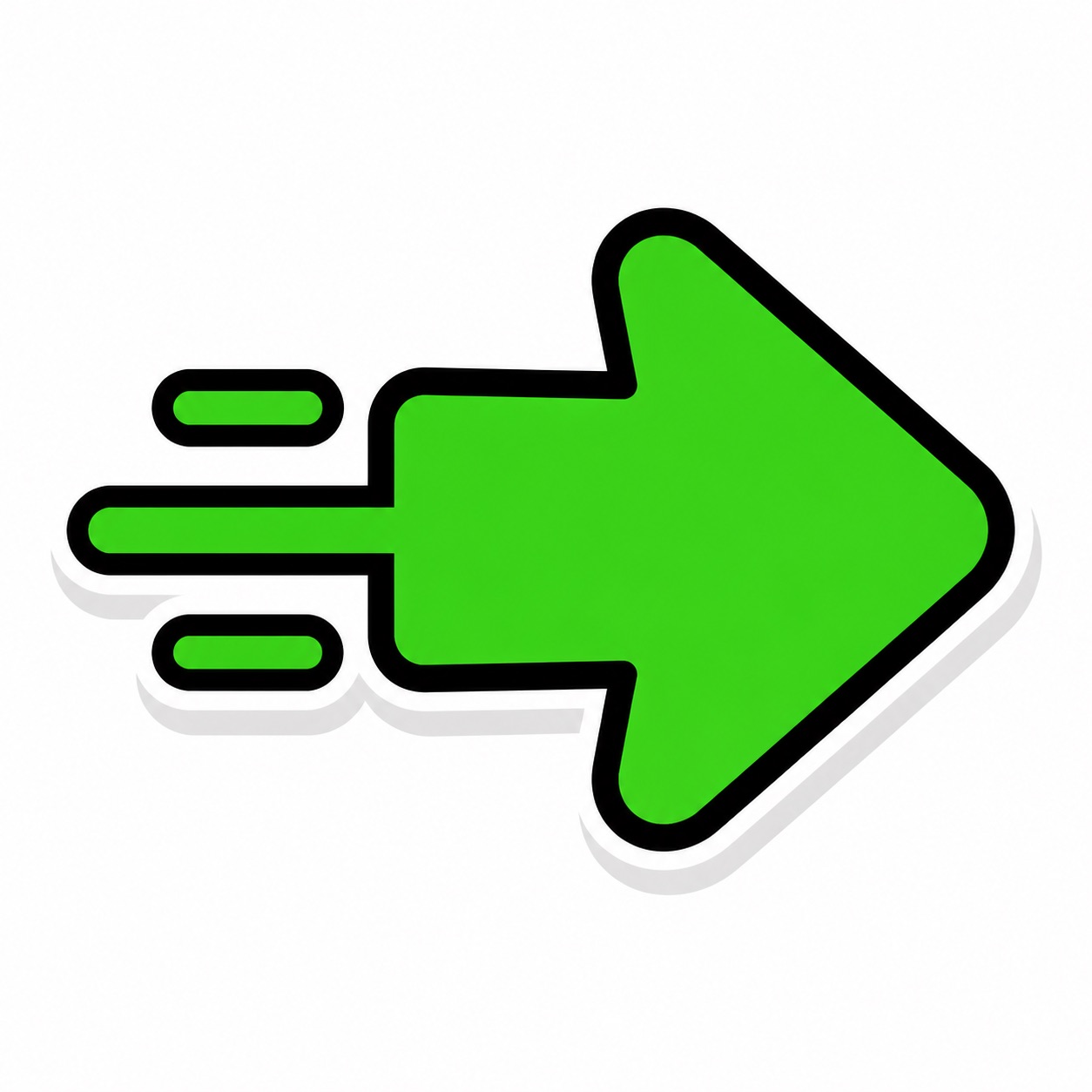
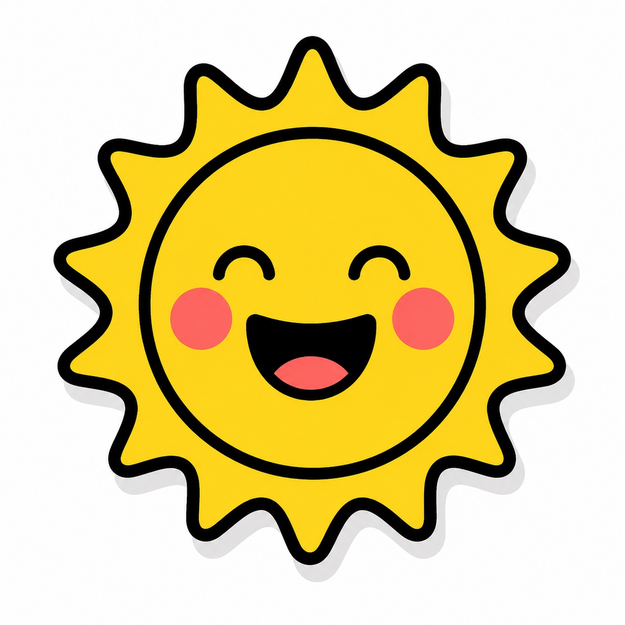
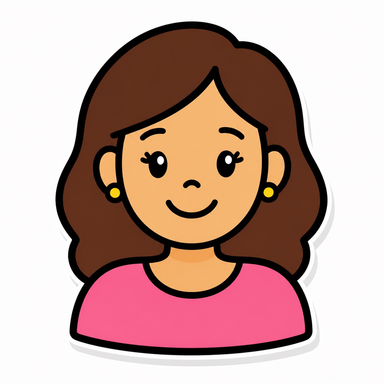
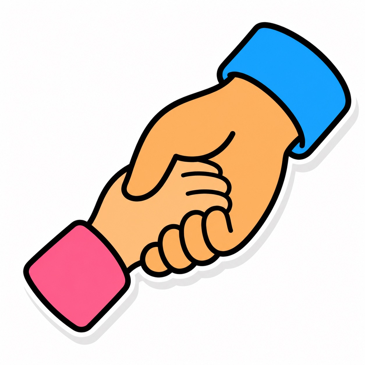
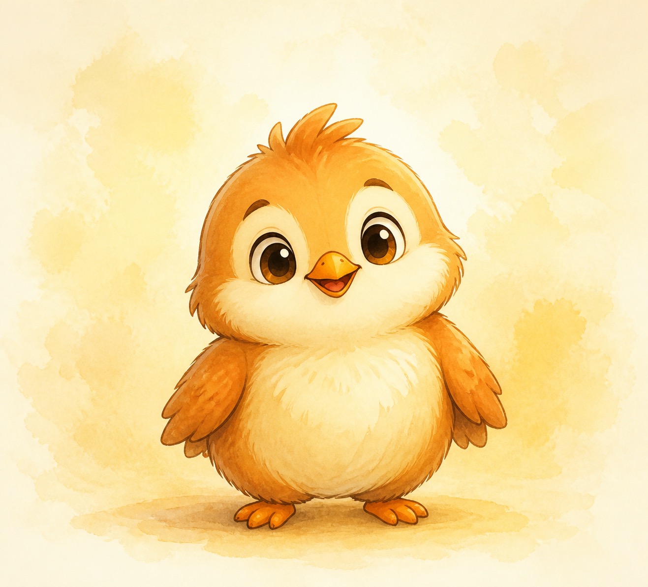
Bright & Bubbly
Saturated colors, thick outlines, 3D pop. Every symbol looks like a sticker you'd peel off a sheet. Bold, playful, unmistakably a children's app. Maximum energy without crossing into overwhelming.
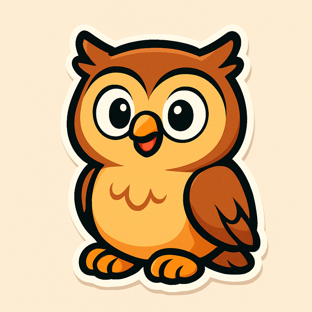
Fitzgerald Key treatment: Full-saturation color as a thick rounded border (4pt). Tile interior stays white. The bold border IS the color coding — native to the thick-outline language.
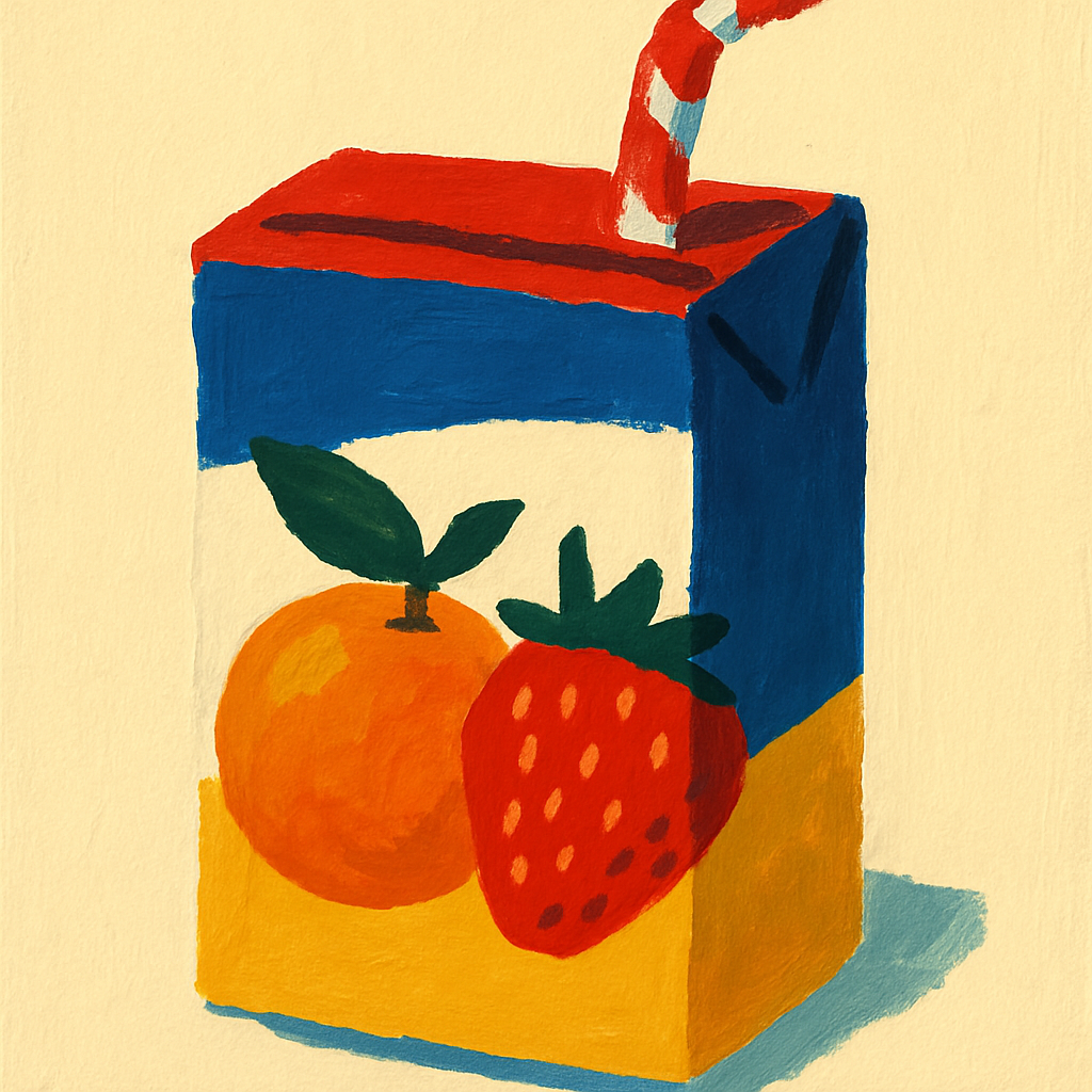
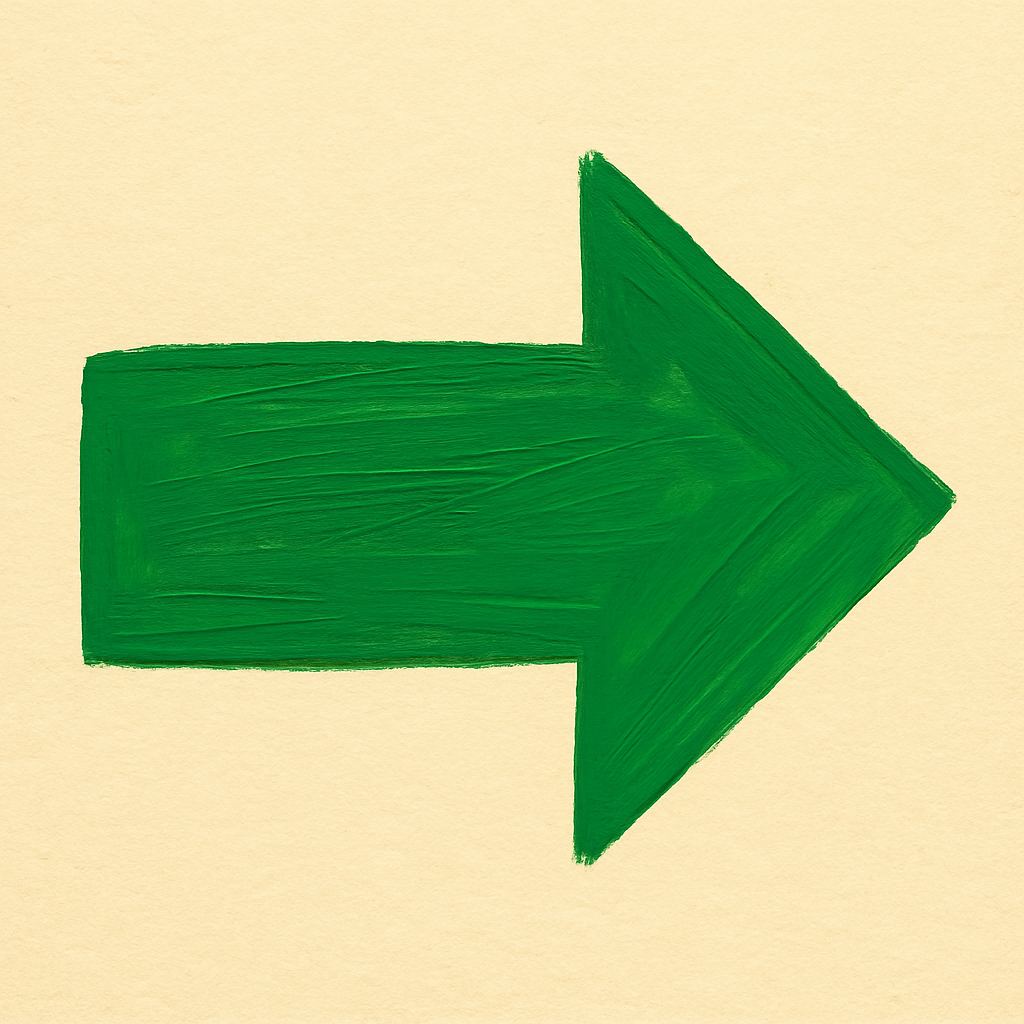
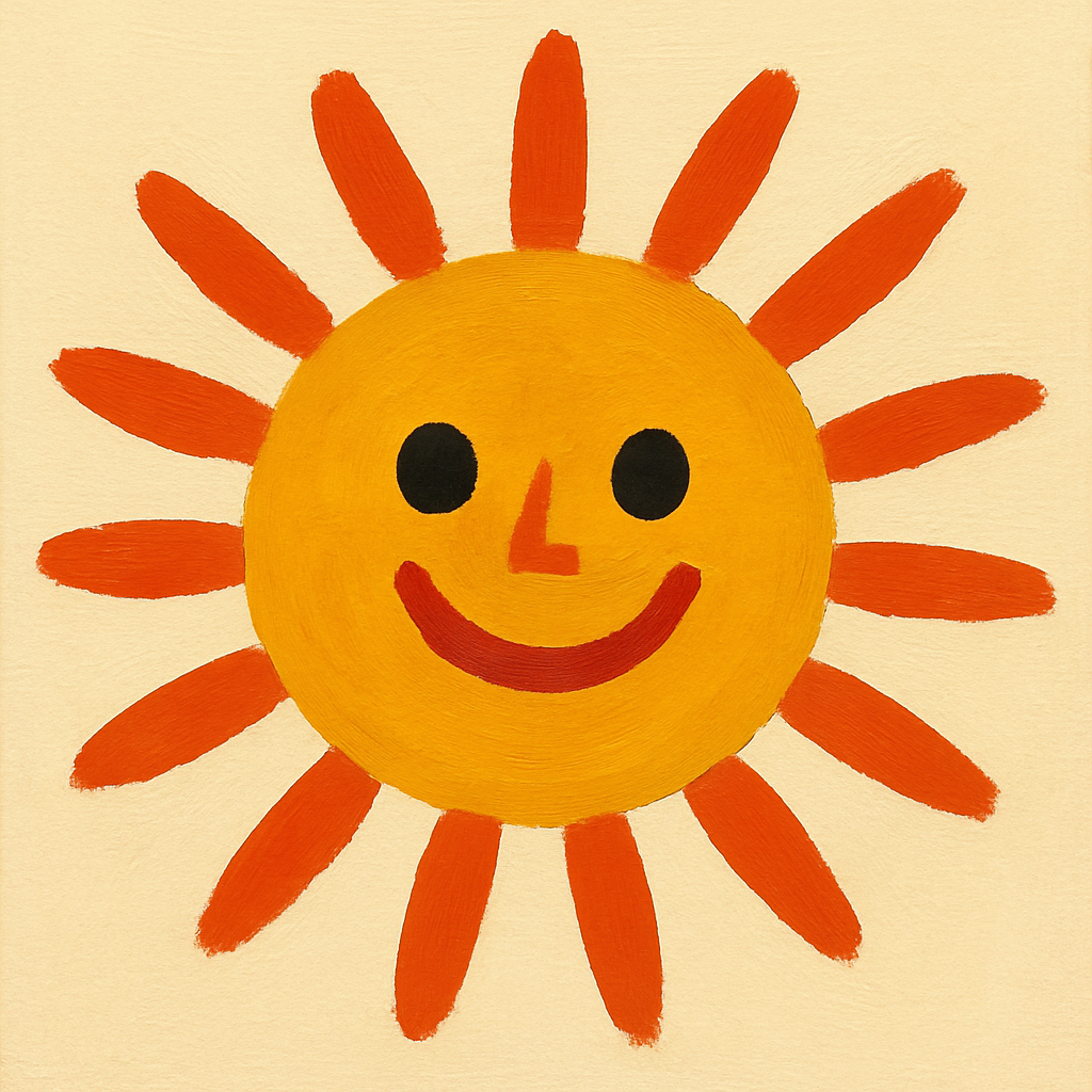
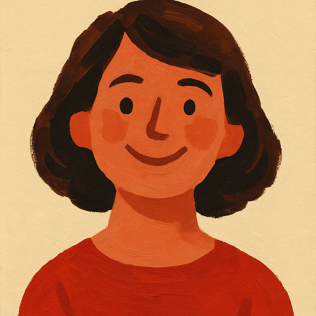
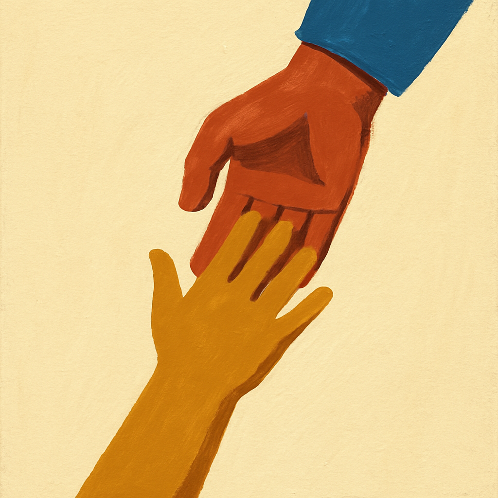
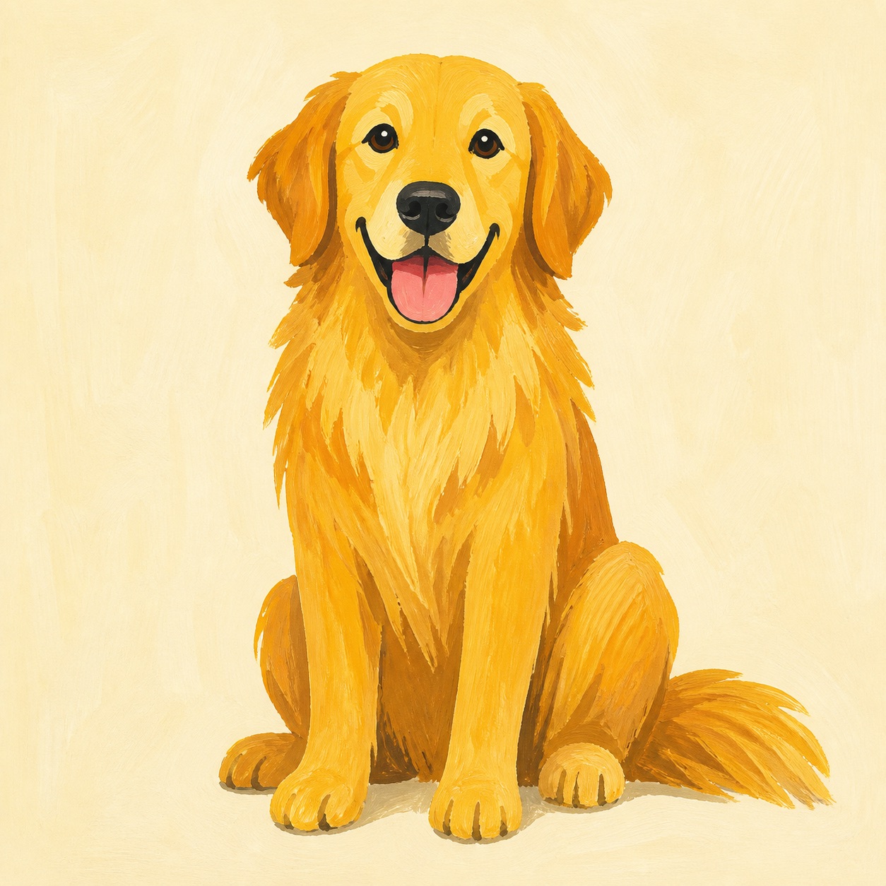
Gouache
Thick opaque paint with visible brush strokes and rich saturated matte colors. Every symbol looks like a page from a beautifully illustrated children’s book — painterly but graphic, warm but bold. The premium option.
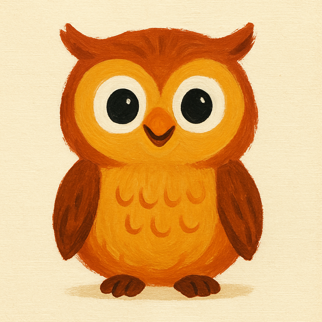
Fitzgerald Key treatment: Thick painted border-bottom in grammar color. The brush-stroke texture makes Fitzgerald Key colors feel artistic, not clinical.
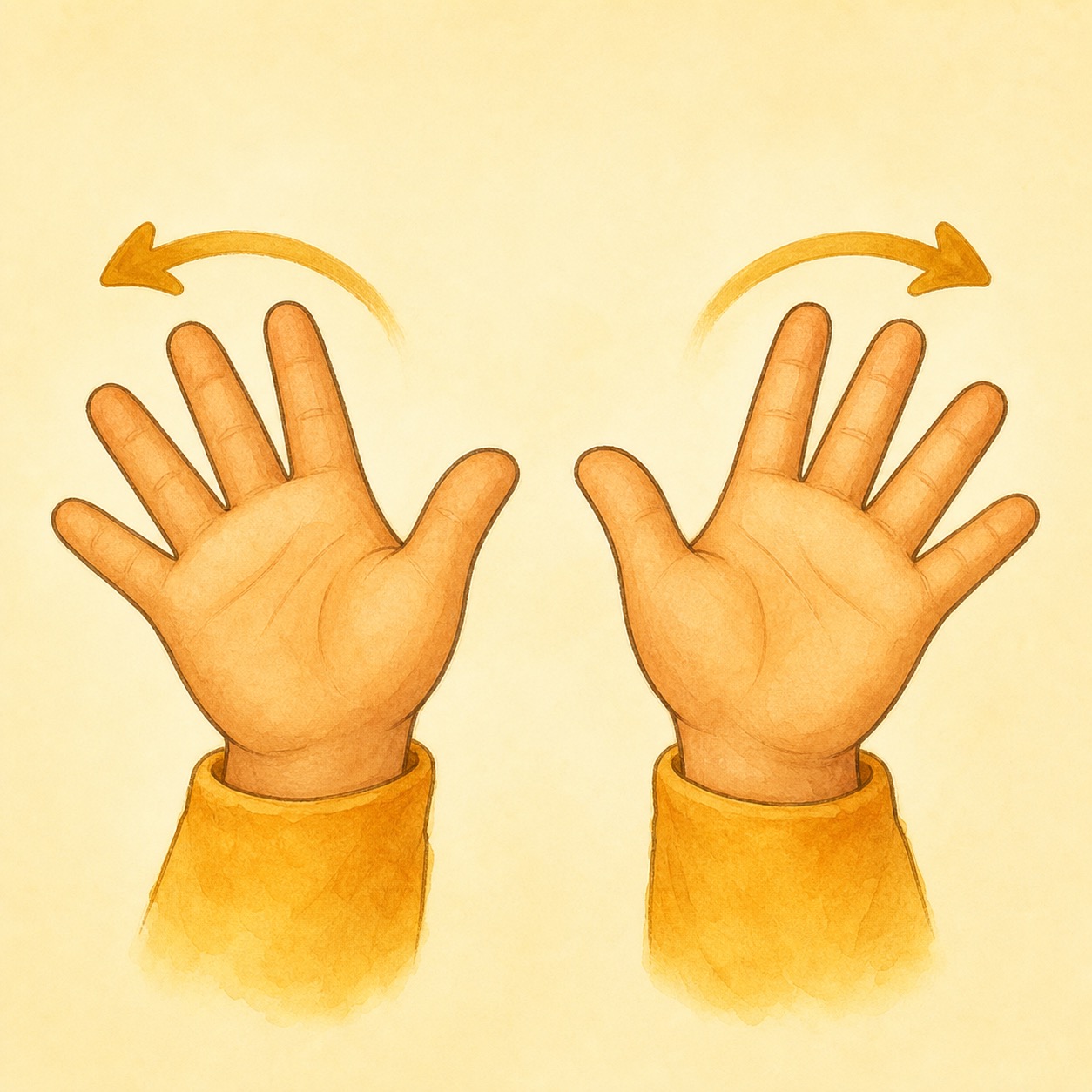
How movement reinforces communication
Animation in Meadow serves communication, not decoration. Every motion has a purpose: confirm a tap, celebrate a word, or guide attention. These principles apply across all four visual styles.
Tap Feedback
Brief scale-down on press, spring-back on release. The tile visually responds to confirm the tap registered. Consistent across every tappable element.
Celebration
Three tiers: subtle glow (Foundation communication), warm burst with particles (Speak With Me correct tap), gentle pulse (any other tap). Never startling. Never loud. Always warm.
Speak With Me Spotlight
Gentle vignette dims the scene except the target word. The spotlight breathes slowly to draw attention without startling. Auto-advances after the expectant pause with a soft fade.
Scene Transitions
Cross-fade between routines (300ms). The compass frame never animates — it is the stable reference point. Only the center stage transitions. No sliding, no bouncing, no spatial confusion.
Signing Bubble
Sign animation plays once per tap, 1–2 seconds, simultaneous with TTS. Ease-in start, natural motion, ease-out to resting hand. Pre-rendered per word for consistency.
Reduced Motion
Respects the system Reduce Motion setting. Celebrations become color changes only. Spotlight becomes an instant highlight. Scene transitions become instant cuts. Signing bubble plays at half speed.
Animation specs are style-agnostic — the same motion language applies to Soft Crayon, Storybook, Bright & Bubbly, and Gouache. What changes between styles is the visual treatment of particles, glows, and celebration effects, not the timing or behavior.
Four strong directions
All four styles use the same engine, the same vocabulary, the same navigation. The choice is purely about personality — what feeling the child (and their family) should get when they open the app. Each direction has a distinct narrative that parents, SLPs, and funders can connect with.
What you are deciding today
- Which visual direction Meadow should prototype first.
- Not the final irreversible launch style for every asset.
- Not a final clinical signoff on every symbol treatment.
This isn't binding. It's a direction to start producing real assets. You can change your mind after seeing full-resolution samples. Pick one path to start:
Meadow — Visual Design System — M1-004 — May 2026
Images are AI-generated samples, not final production assets. All styles use the same underlying engine.